Medinvest is a medical group based in Romania and founded in 1998 out of a small apartment by a doctor after years of working in public hospitals. The group now consists of a clinic, laboratory, hospital and a medical imaging centre.
Coinciding with the launch of the hospital in 2018, Medinvest needed a full brand repositioning and a redesign of the entire visual identity with its extensive and complex touch points.
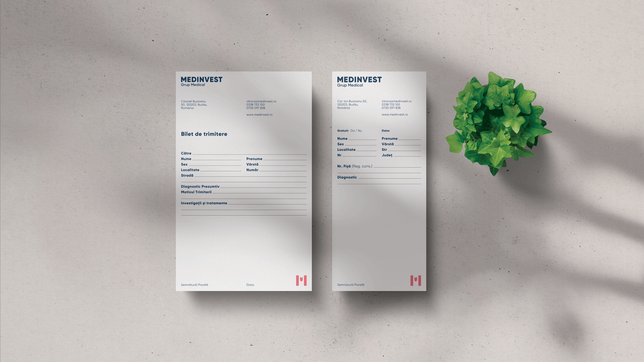
The project included a new visual identity, a website redesign, corporate and team photography, interior and exterior signage, a wayfinding system and print design.
The new monogram symbol represents the letter M from the name, formed of 3 separate elements with the middle element representing a downward arrow. The 3 elements within the symbol represent the 3 major components the founder believes to play an important role in the act of healing:
1. The self-healing property of the human body (doctor's job is to facilitate the body to start its healing process at every step of the way).
2. The 8 major health-generating factors (Sunlight, Fresh air, Adequate Hydration, Regular Exercise, Proper Sleep, Good Nutrition, Temperance and Proper Emotional/ Spiritual Management)
3. And the third element is represented by God's direct intervention through what we call miracles, unexpected healing.
The downward arrow in the middle of the M monogram represents God's direct intervention. A graphic system based on the downward arrow was developed to enhance and unify the overall identity and was deployed on all the brand touchpoints. An extensive colour palette inspired by the brand's mission and values, was chosen to give the identity enough room to grow.
The result is a modern and complex yet cohesive visual system that helps Medinvest take its place at the forefront of private medical services in the region.


Is your brand in need of help?

© Studio Necula 2024-2025

